MatchaBar
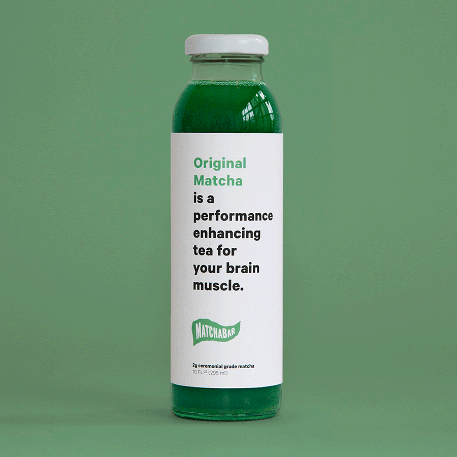
We took the redesign as an opportunity to give the brand a voice. Instead of a little brand story on the back like most beverage labels have, we used the bottles as tiny billboards. Every bottle became a chance to give our point-of-view, taking on Big Energy and differentiating ourselves immediately allowing us to stand out on the shelf.


Shake The Shit out of it.
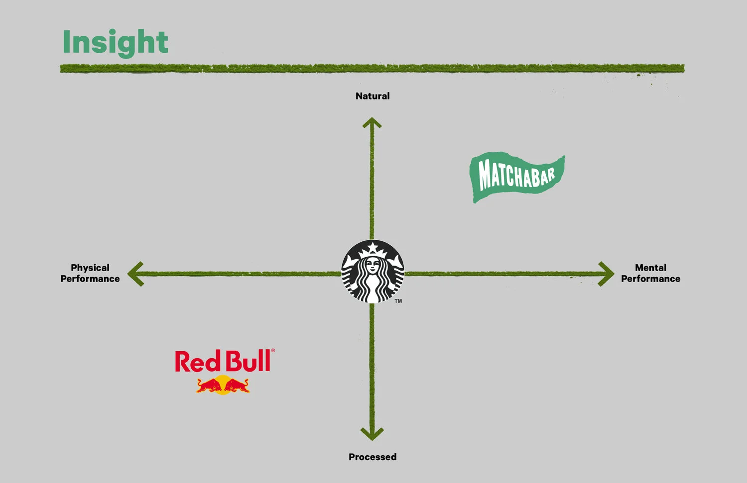
The major insight was that in the energy category these days it's not just about fuel, it's about focus. Calm, focused energy that is driven by matcha's natural caffeine and the not-so-secret ingredient L-Theanine that provides the landing gear instead of the crash of coffee.

Old Boring Packaging
New Awesome Packaging
CD: Graham Douglas & Andrew C Bly
CW: Don Principe & Josh Chua
Iconography Designer: Bobby McKenna